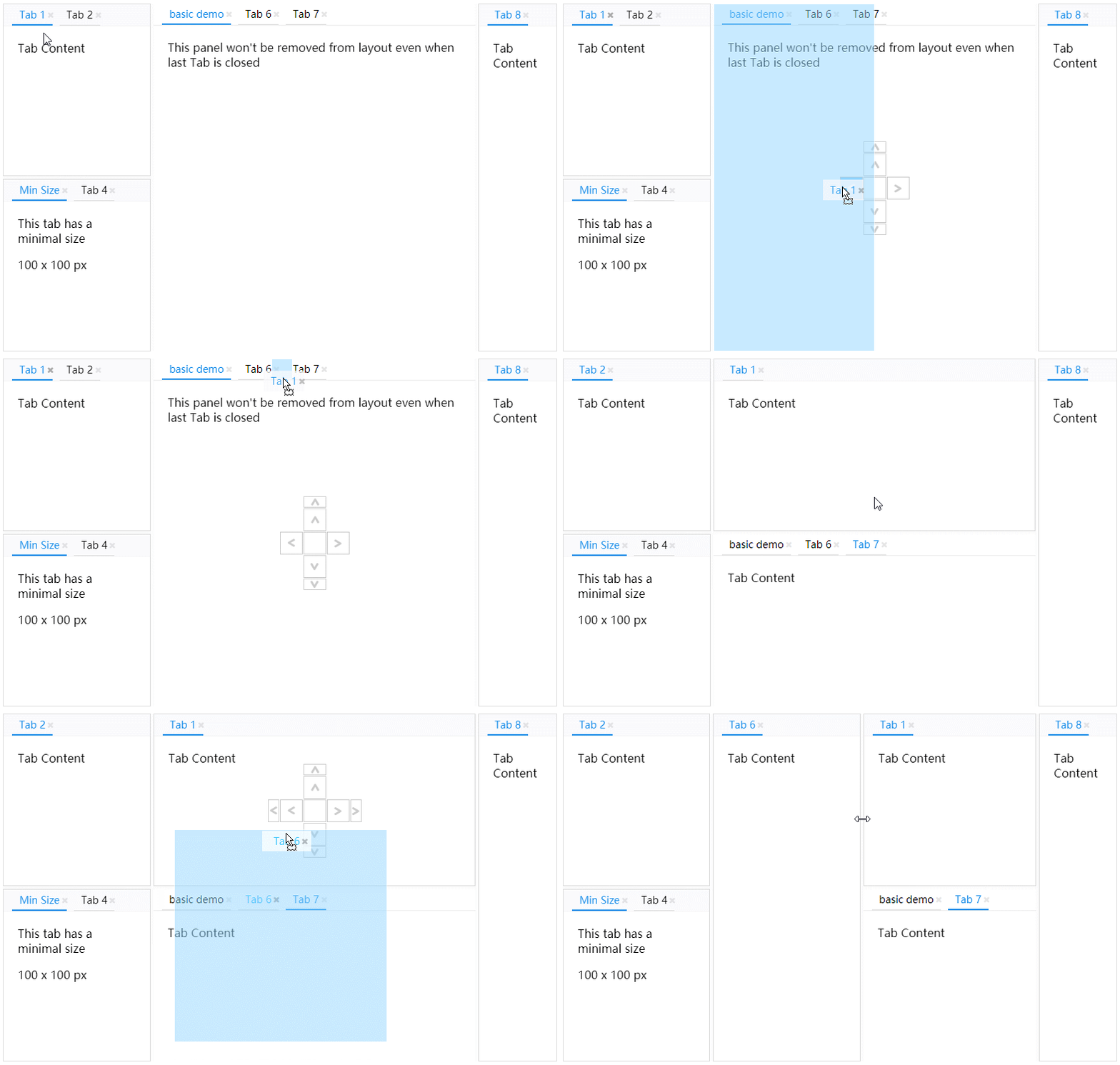
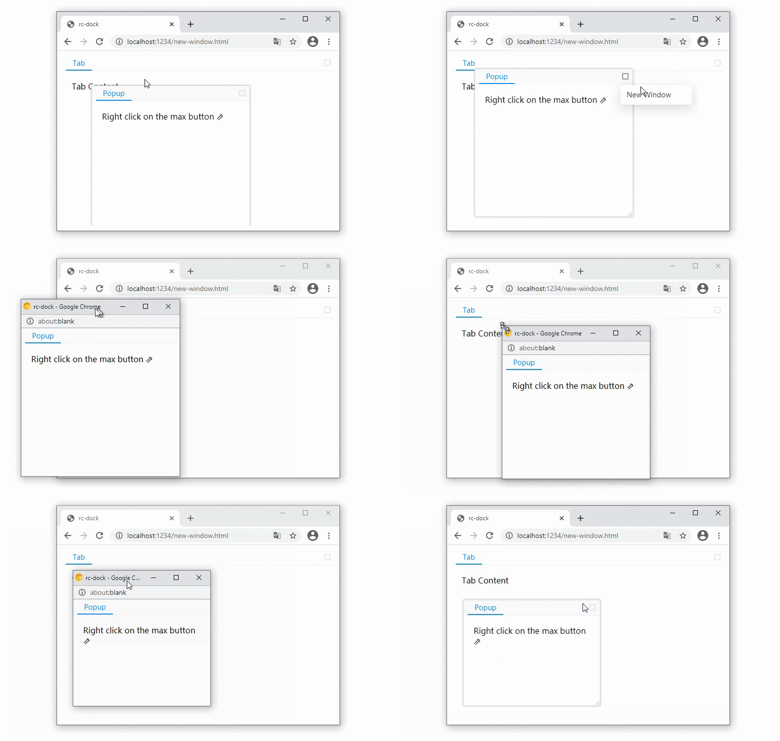
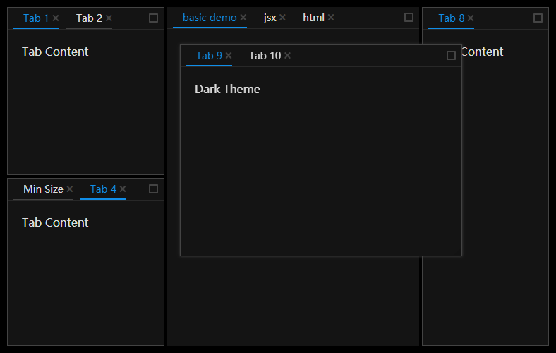
- Examples: https://ticlo.github.io/rc-dock/examples
- Docs: https://ticlo.github.io/rc-dock
- Discord:

The tests use Vitest 5 and Playwright with Chromium, following Ticlo's Node and browser test setup. Use Node 24 for development.
pnpm install
pnpm exec playwright install chromium
pnpm test                  # Layout algorithms and serialization
pnpm test-browser          # React components and drag/drop in Chromium
pnpm test-browser-ui       # Watch browser tests with a visible browser
pnpm test-typecheck        # Type-check source, tests and test configuration
pnpm test-coverage         # Node coverage in coverage/node
pnpm test-browser-coverage # Browser coverage in coverage/browser
Tests live under test/node and test/browser, outside the published source build. Browser tests import the SCSS styles directly and clean up rendered roots and active drags after each test.
Coverage is based on the basic, tab-min-size, standalone-divider, save-layout, controlled-layout, tab-cache, adv-tab-update and drag-new-tab examples, plus drag-preview opacity and cleanup.

import DockLayout from 'rc-dock'
import "rc-dock/dist/rc-dock.css";

...

tabs = {
  tab1: {title: 'tab1', content: <div>Hello World</div>}
};

defaultLayout = {
  dockbox: {
    mode: 'horizontal',
    children: [
      {
        tabs: [
          {id: 'tab1'}
        ]
      }
    ]
  }
};

render() {
  return (
    <DockLayout
      defaultLayout={defaultLayout}
      tabs={tabs}
      style={{
        position: "absolute",
        left: 10,
        top: 10,
        right: 10,
        bottom: 10,
      }}
    />
  )
}
- use as uncontrolled layout
- set layout object in DockLayout.defaultLayout
- use as controlled layout
- set layout object in DockLayout.layout
tabs holds tab definitions keyed by id. Layouts can contain only {id} references, while titles, content and tab options live in tabs. The registry key supplies the id. Full inline tab definitions remain supported.
When an id is missing from tabs, loadTab can create its definition from the tab reference:
<DockLayout
  defaultLayout={defaultLayout}
  tabs={tabs}
  loadTab={({id}) => documents[id] ? createDocumentTab(id) : null}
/>
Returning null skips an unavailable tab. Without loadTab, rc-dock uses full inline definitions or definitions from defaultLayout; unresolved references are skipped. saveLayout() and onLayoutChange save tabs as {id} by default. Use saveTab to include custom serializable fields for loadTab to restore.
Replace the tabs object to update open tabs' titles and content without changing their positions or active selection. Tabs outside the registry retain their loaded definitions. Cached component state is preserved for the same id and component type. Closing a tab removes its layout reference; its registry entry remains available to reopen it with dockMove({id}, target, direction). Registry definitions are copied before use.
Keep the tabs object and unchanged definitions stable between unrelated renders (for example, with useMemo). Registry updates reuse unchanged tabs and layout branches. For frequent updates to one tab, updateTab(id, definition) changes that tab directly.
Configure the outer columns of a horizontal root with at least two children:
<DockLayout
  defaultLayout={defaultLayout}
  tabs={tabs}
  sideColumns={{
    left: {collapsible: true, accordion: true, padding: 10},
    right: {collapsible: true, accordion: true, padding: 10},
  }}
/>
collapsible: collapse a column to tab titles; selecting a title restores it.accordion: expand one panel and shrink the others to their headers.padding: outer spacing in pixels, even without a column; removed while collapsed.
Column state is saved with the layout. See the side-columns example.
Import rc-dock/dist/rc-dock.css for the light theme or rc-dock/dist/rc-dock-dark.css for the dark theme. To customize theme variables, use the SCSS source:
@use "rc-dock/style/index-light" with (
  $primary-color: #108ee9
);
Use rc-dock/style/index-dark for a custom dark theme. Run pnpm build-scss to regenerate both distributed CSS files.
LayoutData 🗎
| Property | Type | Comments | Default |
|---|---|---|---|
| dockbox | BoxData | main dock box | required |
| floatbox | BoxData | main float box, children can only be PanelData | empty BoxData |
BoxData 🗎
a box is the layout element that contains other boxes or panels
| Property | Type | Comments | Default |
|---|---|---|---|
| mode | 'horizontal' | 'vertical' | 'float' | layout mode of the box | |
| children | (BoxData | PanelData)[] | children boxes or panels | required |
PanelData 🗎
A panel contains tabs and their content.
| Property | Type | Comments | Default |
|---|---|---|---|
| tabs | TabData[] | children tabs | required |
| panelLock | PanelLock | Keeps empty panels and prevents dragging the whole panel into the floating layer; also provides sizing and header overrides. |
TabData 🗎
| Property | Type | Comments | Default |
|---|---|---|---|
| id | string | unique id | required |
| title | React.ReactChild | tab title | required |
| content | ReactElement | (tab: TabData) => ReactElement | tab content | required |
| closable | bool | whether tab can be closed | false |
| group | string | Tabs with different groups cannot share a panel through drag and drop. Configure groups with LayoutProps.groups. |
get the ref of the DockLayout component to use the following API
saveLayout 🗎
save layout
saveLayout(): LayoutBase
loadLayout 🗎
load layout
loadLayout(savedLayout: LayoutBase): void
dockMove 🗎
move a tab or a panel, if source is already in the layout, you can use the find method to get it with id first
dockMove(source: TabBase | PanelBase, target: string | TabData | PanelData | BoxData | null, direction: DropDirection, floatPosition?: FloatPosition): void;
find 🗎
Find a tab, panel or box by id or predicate. The default filter searches tabs and panels; use Filter.All to include boxes.
find(id: string | ((item: PanelData | TabData | BoxData) => boolean), filter?: Filter): PanelData | TabData | BoxData | undefined;
updateTab 🗎
update a tab with new TabData
Returns false if the tab is missing or its replacement cannot be resolved.
updateTab(id: string, newTab: TabBase | null, makeActive?: boolean): boolean;